February 6, 2012
Latest Kaiser Permanente signature hoisted to the heights
The evolution of Kaiser Permanente's brand logo stays close to the vision and mission of health care.
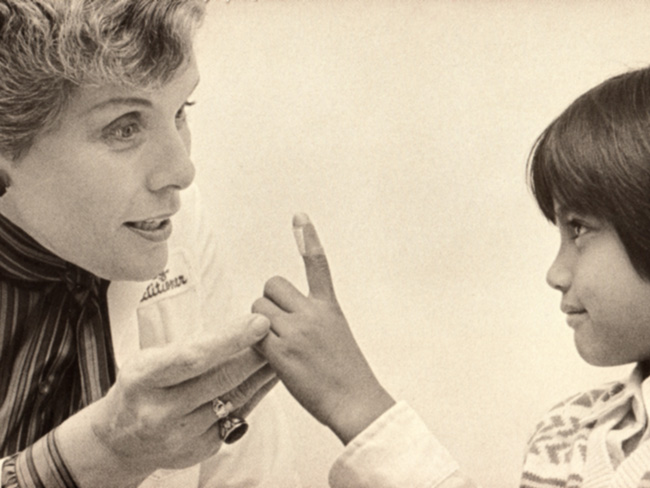
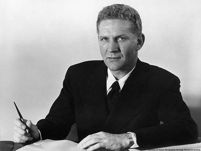
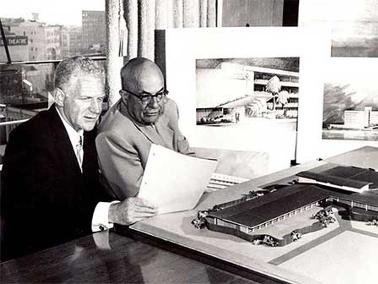
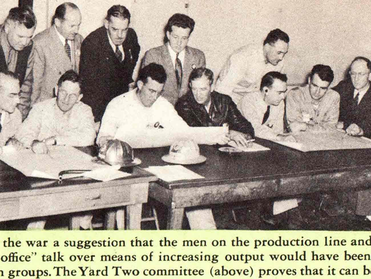
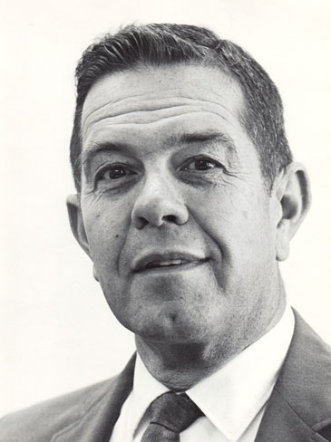
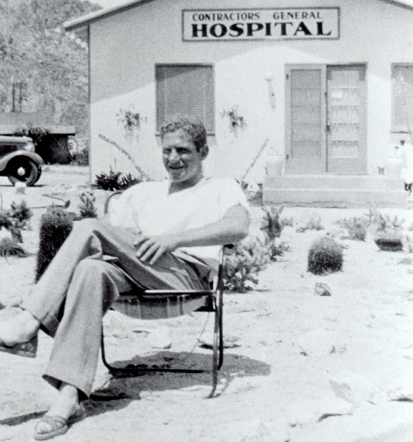
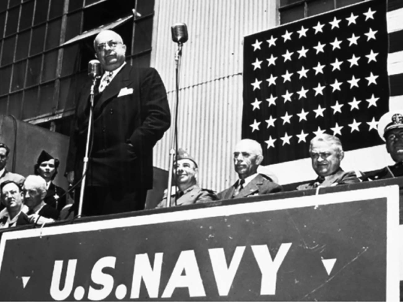
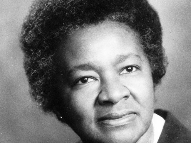
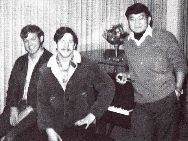
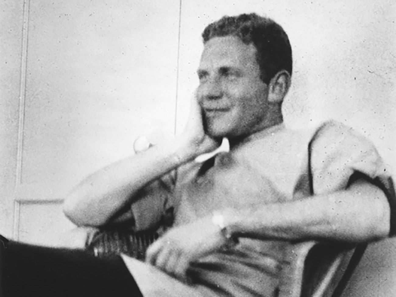
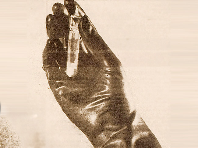
Douglas Boyd at design console circa 1985
On January 18, 2012, executives and contractors gathered in a top floor conference room a block away from The Ordway building in downtown Oakland, California. As darkness settled, brief speeches were made, a ceremonial switch was flipped, and huge Kaiser Permanente signs on both sides of the structure’s summit lit up with the energy-efficient brilliance of thousands of light emitting diodes.1
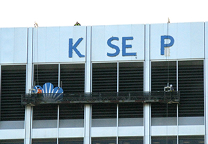
New Kaiser Permanente signage on The Ordway building, 12/20/2011.
This was the first signage ever mounted on The Ordway, and it represents the most current appearance of the Kaiser Permanente logo, a copyrighted symbol that brands everything from pill bottles to skyscrapers. The new signs can be seen from across the city at night, and with the 1950 Franklin building, present two pairs of Kaiser Permanente illuminated signatures on the Oakland cityscape.
The Ordway, constructed in 1970, was named after Henry J. Kaiser’s first employee and long-time and trusted operations manager A.B. (Alonzo Benton) Ordway. “Ord,” as Kaiser called him, was hired in 1912 — 100 years ago — when Kaiser was with the Canadian Mineral Rubber Company.
The Ordway is adjacent to the Kaiser Center at 300 Lakeside, Henry Kaiser’s pride and joy in 1960, which at 28 stories was the tallest building in the East Bay at the time it opened. Formerly the Kaiser Industries headquarters, the center still carries a sign that simply says “Kaiser.” The Ordway, Kaiser Center, and the nearby 1950 Franklin St. building accommodate many of Kaiser Permanente's administrative offices.
Kaiser Permanente brand identity evolved over decades
“Family of four” logo, 1972
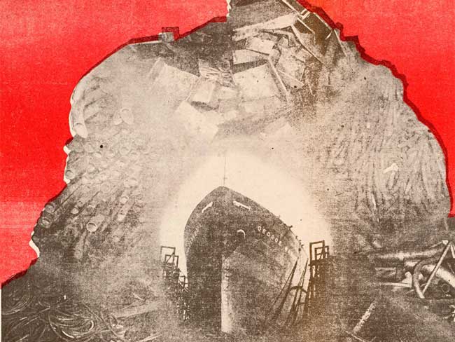
Sporting a consistent and polished brand signature is relatively new in Kaiser Permanente’s 67-year existence. During World War II, Permanente Metals, which operated a medical care program for its wartime workers, did not develop a separate logo for the health plan. Rather, the Permanente Metals logo of three ship hulls inside a compass rosette appeared on the health plan brochure. The trio of ships likely represented the three West Coast wartime shipyards where Henry Kaiser built warships.
Although the health plan evolved on its own after the war, there is no evidence leaders sought any brand identity other than adopting for Kaiser Permanente’s signage the same typeface and style used to identify each of the Kaiser Industries companies.
‘Family of four’ mark emerges in 1970s
In the early 1970s, a silhouette nuclear “family of four” mark began to appear in publications and signage for the Kaiser Permanente Medical Care Program. In 1982 the Southern California Region hired Boyd Communications of Los Angeles to produce its own regional logo. Douglas Boyd designed a mark that featured one of the human figures but also integrated a stylized “K” for Kaiser Permanente.
Pre-1984 logo
The idea of a unified graphic representing all Kaiser Permanente’s regional health plans did not emerge until 1984, when a corporate identity committee was formed. The committee included Kaiser Foundation Health Plan and Hospitals Chairman and President James A. Vohs, Don Duffy, head of Corporate Communications, corporate identity experts, KP regional managers, and medical directors.
Logo design sparks debate in the 1980s
Southern California leaders had this logo created in the early 1980s.
Kaiser Permanente was growing, and the “family of four” graphic that had been used by several — but not all — Kaiser Permanente regional health plans was not only amateurish and antiquated, it had been imitated by competitor health care organizations because it was not protected by copyright. Vohs reflects on some of the challenges involved:
“As with almost any issue in Kaiser Permanente, there was a range of opinions about a new logo. Quite often the leaders of the medical groups had different views from the leaders of the health plan. Also, the Southern California Region felt that the organization should adopt the logo they were using.
In addition, consultants from a previous design firm felt that we should change the name of the organization. They thought strongly that ‘Kaiser Permanente’ as a title for a health care organization was a negative, and urged us to abandon it. (They were concerned that the name “Kaiser” was too closely identified with Henry J. Kaiser’s steel and aluminum industry, not with patient care and wellness).”
Vohs continues: “But from my point of view there were really just two concepts that needed to be reflected in any logo: that the arrangement between the ‘partners’ in the enterprise, the health plan and the Permanente Medical Groups, be recognized; and that there be just one style of logo used consistently throughout the organization to reinforce that Kaiser Permanente is one single multiregional and national enterprise.”2
1984 version logo
The resulting logo, created by Douglas Boyd of Boyd Communications, was a distillation of concepts that reflected Kaiser Permanente's mission. When the new graphic identity was released in 1985, a brochure was distributed explaining some of the design parameters and solutions:
“It had to convey: a feeling of warmth and caring; a sense of quality and professionalism; concern and commitment to one another; the partnership we share in providing health care to the community; and a progressive feeling.
“... The sense of community is there in the three figures. They can represent the three entities that make up our program (the Kaiser Foundation Health Plan, Kaiser Foundation Hospitals, and the Permanente Medical Groups), the families we serve, and the communities we’re located in. The radiating light transmits a sense of health and healing. The sunburst also reminds us of our roots in the desert, where (Kaiser Permanente founding physician) Sidney Garfield started providing prepaid medical care more than 50 years ago (1933).”
Signature suits the company’s mission
Current Kaiser Permanente logo
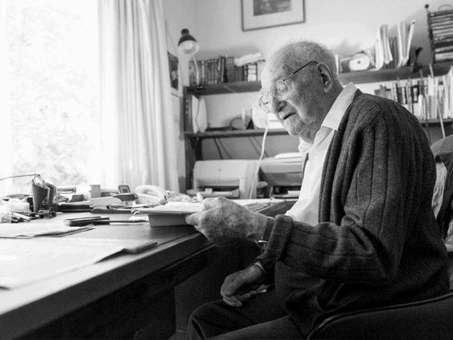
Boyd, who has created logos for many international businesses such as Apple, Hilton, and Toyota, is humble when describing his team’s part in designing the Kaiser Permanente logo. He likens his role to a “tailor” who simply put a nice “suit” on Kaiser Permanente.
“To be somewhat objective, it’s what the organization has done that makes the logo,” Boyd said. “A logo can’t make a company. And Kaiser (Permanente) has done an extraordinary job at becoming the best in the country at providing health care.”3
In 1999 the “family” symbol was slightly revised, this time under the direction of Landor Associates, another world-class strategic brand consulting and design firm, as part of the most comprehensive identity system Kaiser Permanente had ever rolled out. This included a revised logo called the “signature”.
The 17 rays of light in the image were reduced to 14 and the typeface of the words “Kaiser Permanente” was changed. Kaiser Permanente also standardized the horizontal configuration of the logo and type. Subsequent additional tweaking by the design firm of Kate Keating and Associates used even fewer rays in the “people” for enhanced legibility in specialized applications such as embroidery, pharmacy labels, and large signage.
Fittingly, during the centennial of A. B. Ordway’s hire, the towering edifice named after him glows with the most modern Kaiser Permanente symbology.
1 The energy-efficient sign is specially designed to illuminate white through the blue lettering for enhanced visibility at night.
2 Email correspondence with author 1/30/2012
3 Interview 12/2011 with Boyd by Kaiser Permanente communications associate Kathleen Haley