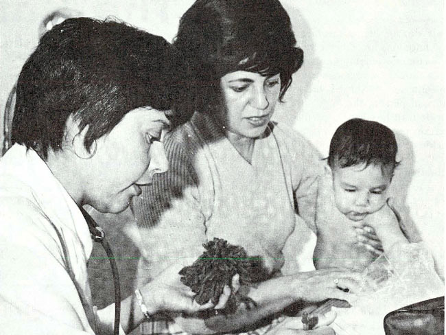
Our history
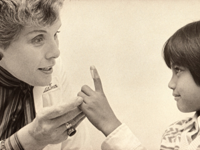
Kaiser Permanente’s groundbreaking integrated care model has evolved through the decades — and we’re still improving care delivery for our members to this day.
How we evolved
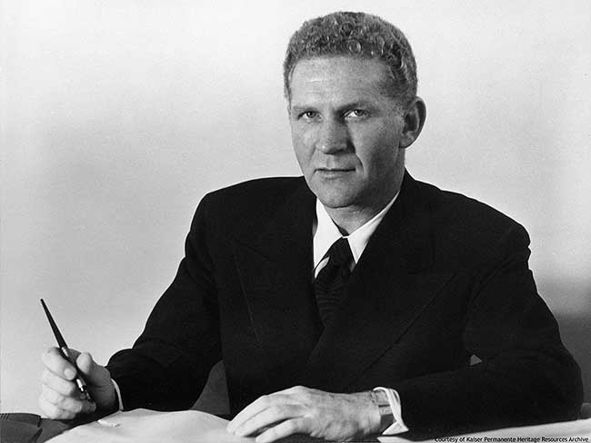
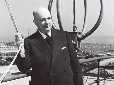
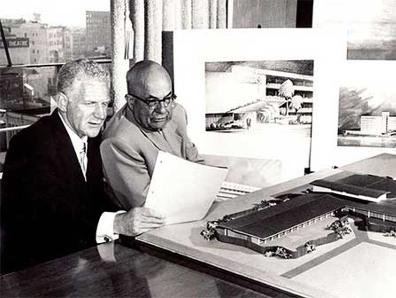
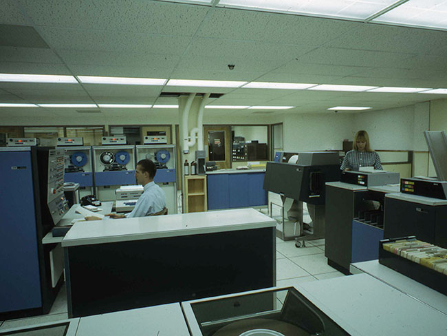
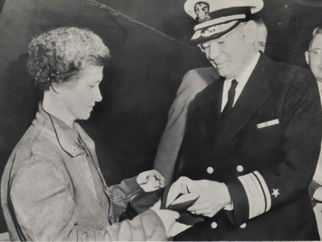
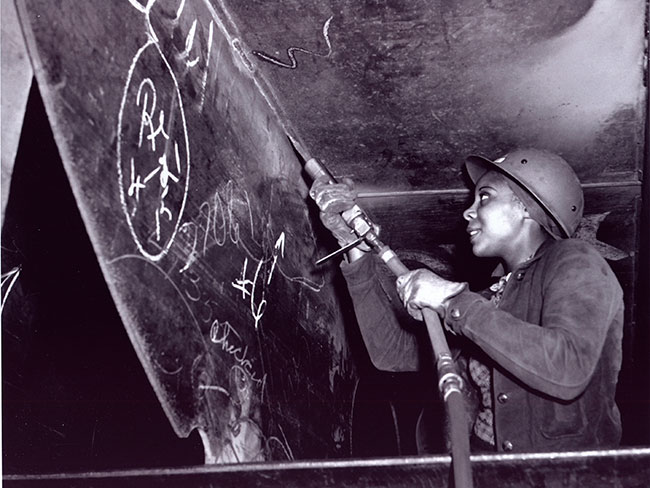
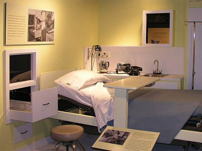
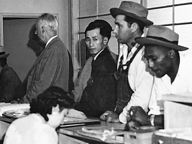
Discover our roots in the Great Depression and World War II shipyards and see how we’ve been revolutionizing care delivery since 1945.
Groundbreaking moments
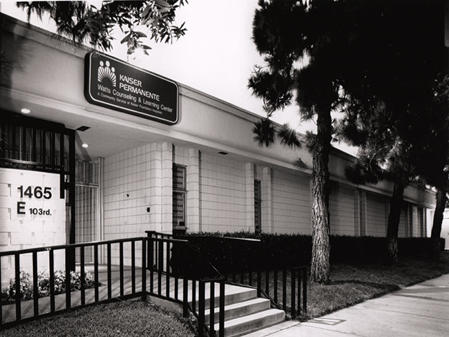
Explore how people, medicine, and technology came together to shape Kaiser Permanente's mission: to provide high-quality, affordable health care services and to improve the health of our members and the communities we serve.